Product Line Documentation

The company will go by the name of “Reigning Kings”. The concept would revolve around the tag line and idea of “where everyone is treated like a king” or “In here everyone is king”. This would expand on with the advertising and marketing campaign of the company.
The packaging would include some character and development and illustration work to achieve the initial mark of the company. The idea is to create a character that will be identifiable on the packaging as well as inviting and accepting of all people. This is so people will remember the product as well as the name that is attached to the product and in this case that being beer.
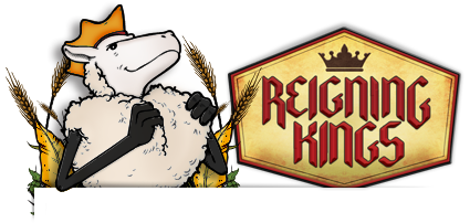
The character in mind for the product would be a white-coated sheep. This sheep would be a very confidant and a proud sheep. On the packaging the sheep would essentially be grinning or smiling and holding on to his fur as if it was a nice coat or robe, tugging at the collar signifying pride in himself and the beer that he represents. The idea behind this is that a sheep is usually looked upon as a vulnerable animal and not a strong one. When people think the word “king” most of the time their thoughts jump directly to a big man in power or a lion or something of that nature. This sheep is out to represent everyone and every style.
I want for people to identify with this animal in the sense that you don’t have to be a big and powerful being to be treated to the amazing things that a king would be treated to. Including this beer in particular.
The ad campaign that would follow to promote the company would depict a person sitting in a bar at a table and looking directly at the camera, the individual would have a simple crown on that would be similar to the packaging of the 6 pack that you can buy of the beer. In the background would be people enjoying themselves and all around the individual that is in focus would be friends and family. But each individual would change with each add to show that every type of person and or style can and will be treated like a king with this company and beer. Some examples of the people sitting at the table with the crown on would be, a rap artist, a tattoo person, a business woman/man, a dad, and etc. Also as the campaign went on if it caught the attention of people then celebrities could sit in the chair and be focused on in the ad if they choose to do so.
6 pack packaging idea | sustainable
The packaging for the 6 pack that a person would purchase in a store would resemble that of a normal six pack box but would have things and graphics to resemble a crown. After all the beer was consumed you would be able to turn the 6-pack box in to a wearable crown. It would have a cheaper elastic strap as well hidden on the underside of the box. Also would have folding points on the side to help assist in turning the rectangular box into a octagon shape to form the crown. When all is done the buyer would be able to put on the crown and wear it around proud signifying that they have consumed the whole six-pack of “Reigning Kings Beer”. The other option would be to empty the package and wear the crown as you consumed the beer. Either way you’re a king.
Individual King Beer | Big Beer
The package for this product would be a half box that surrounded the beer bottle. It would sit in a foam laced square bottom to assure no movement of the product and the box would be dye cut to come half way up the bottle to resemble a king’s throne. The bottle would have the sheep standing proud printed on the front but the bottom half of the sheep would be hidden by the bottom of the box that held the beer in place. On the box the sheep’s legs would be printed as if he was sitting in the throne with his legs crossed but when you remove the beer from the book he is now standing proud as you consume the delicious product.
Items include:
-
6 pack of beer
Individual beer
12 pack of beer
2 pack of beer
Beer nuts
Beer Rub
Gourmet beer accessories
Beer gift pack with glass
Advertising campaign / print ad


No Comments Yet You can be the first to comment!